

Web designers are often unsure about how to deal with trends. Some think that following one cannot be right because it means compromising their creativity. However, you simply need to know everything behind how and why a certain approach becomes a trend. This is simply because trends say a lot about contemporary culture. It’s basically essential knowledge on how to approach your target audience. You have to get to know how they think and what they like, and therefore come up with a design via which you are going to empathize with them.
This means that you cannot avoid trends. Yes, you have the space to be creative within the boundaries of what is “in”, but you must design for the people and not for yourself. Some trends have been around last year as well, but they keep evolving and are still present for a reason. Others appear, and it is up to you to determine which ones are worth pursuing and which ones are fads. Also, you need to design for the future and follow trends that are going to stay around for a while before something else tips the scales.
Going all black and white
It goes without saying that color is one of the essential aspects of web design. It defines your brand and makes the whole experience coherent, giving it a particular mood. Furthermore, it uses visual landmarks to help the user navigate it properly. 2019 is leaning towards bold black and white designs.
If we consider the fact that color defines how we see the world, then when we strip it away, our vision changes. As a result, certain shapes and other items become more or less apparent. It is a great combination of black, a powerful and assertive color, with white, a more constrained and clean counterpart. Together you can create strong impressions and intuitive website designs.
Some designers even pick a single accent color that breaks the monochromatic design and highlights the most important aspects.
Micro-animations
 A trend that has certainly been evolving through the years and is definitely going to dominate 2019 is using animations. However, as opposed to previously popular trends such as parallax scrolling, smaller animations have now become the widely used version. This is most commonly referred to as micro-animations.
These are basically small animated changes that happen when you make a certain action. They still leave an impression and make the page dynamic, while being a lot lighter in terms of affecting the loading time. They are also much less of a distraction, so your main idea of navigation remains unhindered. Next to being a kind of “road signs”, they can also be there to spark interest. You can use them in the form of cinemagraphs, or add effects to your videos.
Custom illustrations and graphic designs
Another popular trend relies heavily on a customized design that clearly presents your brand and makes it stand out from any other. This is the use of custom illustrations and graphic designs. What can make your website more unique than having a graphic artist come up with illustrations that are unique to their style, and therefore make your website one of a kind. They aren’t just great for being as creative as you can get, but they also make unique statements. This is the perfect way to show off your brand personality.
Enticing typography
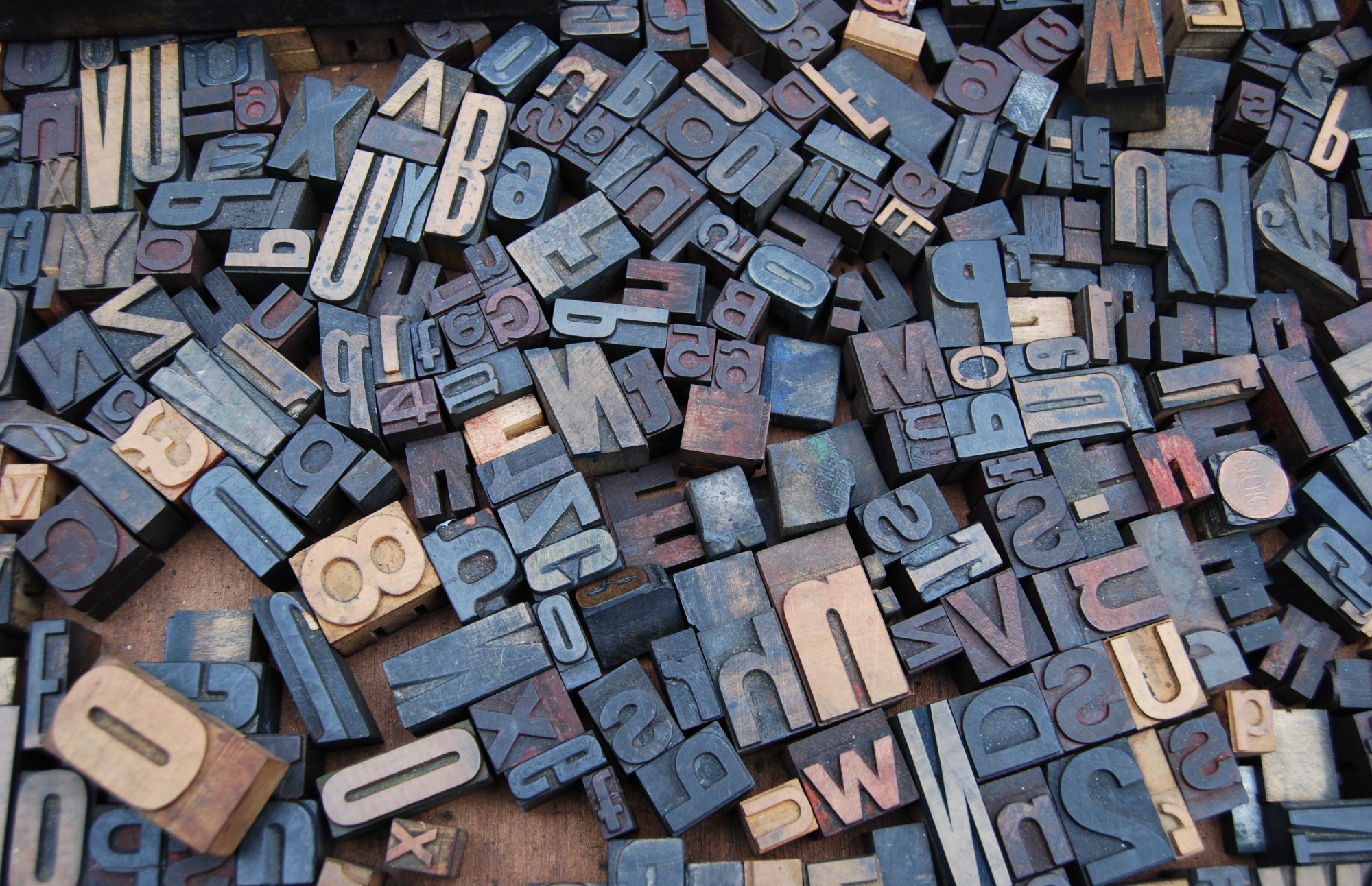 If you haven’t moved out of the comfort zone of using the combo of Times New Roman, Arial, and Calibri, then it’s high that you’ve done so. This is because the trend that has been evolving lately and is certainly going to be essential in 2019 is unique typography that stands out and, just like every other aspect that you implement into your design, tells something about your brand. There are various artistically-different fonts out there that you can use to formulate the right kind of message, be it a serious or a playful one.
The main idea is to use a combination of unique fonts so that each one covers a particular aspect of the page. You shouldn’t use more than three. You can, for example, use an artsy font to highlight your bold headers, and clearer ones for the long texts that follow, while the third underlines navigational items on the page.
Responsive web design
Ever since Google introduced mobile-first indexing in March 2018, the idea of making mobile-friendly websites, and, particularly, turning to responsive web design, has shifted from “maybe” to “must”. This means that it is more than just a trend – it is a necessity for your website’s SEO practices.
The responsive design basically adapts the size and shape of the screen to whatever device a person is using. If you do it right, you will provide the best possible user experience for your mobile visitors. It has gone as far as the fact that some businesses are creating responsive logos that fit different screens.
So, now you can see why, for every trend, it is crucial to have an understanding of how they affect your audience as well as your performance online. If you are having trouble finding the right solution, you can always look for help from those more experienced, such as Hoppingmad website design experts. It isn’t shameful to admit that you are lost among all the booming trends and need a little guidance so that you can determine what the best solutions for your website are.
While following a trend may sound counter-intuitive to a designer that wants to be creative, the fact is that trends appear and dominate the web as a strong reflection of the contemporary culture. Basically, it is important to understand how and why they have become so popular, and then be creative within their boundaries. You cannot simply ignore trends and hope that whatever you thought was creative enough beats your competition.