
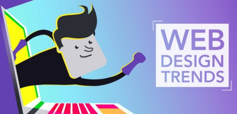
The new-fangled trends keep on emerging on the web design horizon. Although the fundamentals remain intact, but designers have to become the explorer of new ways to entice, attract and retain the potential customers. Above all they need to find out the ways to establish the client’s brand value.
With the technology advancements, the communications in all shapes become more meaningful and prompt. So, the chances are high that older websites cannot keep up with this trend of the corporate world. This demands the business owner to opt for website overhauling to endure the emerging trends. According to the top rated experts of web design in Austin Tx, whether to redesign your site or launch the one from scratch, you should keep in mind the following trends prevailing in the industry.
#1 Minimalist Design:
Parallax web design is still in vogue, but it is not much efficient as per SEO is concerned. So, businesses are largely moving toward the web designs incorporating a well-rounded CMS (content management system). It gives complete support to the site users (admins, vendors and buyers in case it’s an ecommerce site). There was a time when sites were descriptive with a lot of details. Now, the website designs have everything minimal from selection of fonts to colors, call to action, form fields and pop-up windows, etc.
#2 Survival is for the Fastest:
With the Google’s newly launched feature mobile-first-index, the speedy websites come in flashlight. No matter, in the past, the search engines keep on giving the edge to the sites with quick-loading web pages. The reason is the reduced bounce rate. Now, the potential value of a website design set in its easy indexation in the search engines in relation to a wide variety of mobile devices.
#3 Responsiveness Takes the Lead
Responsive design is the need of time because responsive web design is mandatory to branding and Google bots love them the most. This pertains to the need of making your websites compatible with all mobile devices.
Remember, there is a difference in mobile-friendly and responsive websites. The former is built for mobile phone users, while the later is meant to be used flawlessly across all mobile platforms, including laptops smart phones, and tablets etc. Hence, whenever you need to hire web design services, make sure they are giving you responsive design.
#4 Pop-ups are Unwelcoming:
Pop-ups impede the user experience especially on smart phones. The majority of the people do not like pop-up windows to open without their approval. Even the software development firm doesn’t suggest to have this troubling feature. Small pop-ups for advertisements are still in use, but their prolonged appearance on the user’s screen is not much appreciated.
So, besides avoiding to design a site with opening element of multiple windows, designers need to create pop-ups (if the client needs by all means) for a few seconds. Moreover, the closing sign must appear clear on such windows so that user can close it right away.
In a nutshell, whatever you do with a website design it should not trouble the users.
Here are a few things to take care of while making a user-friendly website.
- All-devices compatibility
- Appropriate canvas size
- Seamless readability
- Trouble-free navigation
- Easy-to-load, quality images
- Minimum, but quality content
- Less reliance on pop-up windows