

Mobile devices have officially increased tremendously ever since they were able to access the Internet. The majority of people use their mobile devices to access the Internet more than desktops. The reason being, mobile phones, and devices are conveniently carried anywhere making it easier for their owners to access any information online as they go on with their daily businesses. This has greatly improved access to information by visiting relevant websites through Google and other search engines.
Since many people are using their mobile devices to visit websites, it’s a good idea to make a website mobile-friendly. Failing to do this in your web design services does an injustice to you and your potential visitors who drive massive traffic to websites using their mobile devices. This also hurts your SEO ranking since you are not very visible to search engines and your potential clients. Knowing how important mobile-friendly websites are, here are several ideas to help your websites mobile-friendly.
Make Your Website Responsive

For your website to be responsive, all the information found on the website needs to be rearranged perfectly to be viewed in smaller screens without distortion. If your website is not friendly you will find out that mobile users have a hard time accessing the information on their devices. Some information will be cut out since it won’t fit on smaller screens. This is by far the best way to make your website mobile-friendly since you are not limiting the information from your mobile device visitors. All visitors (on the desktop of mobile) see the same information on your website. And since Google has officially announced that they’ll be using Mobile-first websites to rank websites, responsiveness is helpful for your SEO.
Make Information People Look for Easier to Find
Although some of your visitors using their mobile devices to access the Internet don’t mind taking extra time to find what they are looking for, it is wise to place important items where they are easily accessible. Don’t ignore those who want to get information fast so that they can get back to their busy schedules. To make it simple, put all the information that mobile users look for on your website in an easy to find the area, on the mobile homepage. It is important to consider FAQs as one of the items that visitors look for first but don’t include all the answers on the same page.
Don’t Use Flash
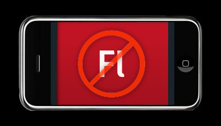
Flash lost the love of webmasters due to its unfriendly nature towards SEO. The reason is slowing down the site’s loading time and some browsers don’t support it at all. It is also not supported by neither Android nor iOS devices, making it an outlawed software. Therefore, don’t think of building a website that depends on Flush animation in any way as this will destroy the user experience. You will risk losing all your mobile users. This technology is a cage and should be done with.
Include the Viewport Meta Tag

An easier way to control how your website displays on mobile devices is to use the viewport meta tag. Mobile users will have a hard time getting information from your website if it opens up the same width on the small screen of your phone as it does on your desktop. They will have to awkwardly scroll from side to side to read each line of text and see the different sides of the page. Viewport meta tag helps browsers to perfectly fit your website’s width depending on the device used by the visitor.
Adding a viewport meta tag to your HTML is simple and all you have to do is paste <meta name=”viewport” content=”width=device-width, initial-scale=1″>onto the HTML for each page.
Turn Autocorrect Forms off
If you have a form on your website, it may be difficult for your mobile visitors to fill it, if it is not properly displayed on smaller screens. Many webmasters underestimate the power of autocorrecting for forms and tend to ignore it. For easier access of forms that ask for name or address information from the visitor is to turn off autocorrect for each form field.
Failure to do so will make phones change the fields to common words and slow down the form filling process. To do this, ensure that in the input field, you include autocorrect=off in the HTML.
Increase Your Button Sizes to Work on Mobile
When using a PC, it’s very easy to click on any size button with a mouse. Coming to mobile phones, tapping a small button on a small screen is somehow tricky especially if there are several buttons close together. It gets worse when you are blessed with huge thumbs! To save your mobile visitors from this headache so they can enjoy interacting with your website, use large enough buttons on the mobile version of the site. Before adding buttons on your site, ensure that you test them out yourself. You can use one of your family member’s phones or an employee’s. It is also wise to test on more than one type of mobile device.
Conclusion
Since mobile devices keep on changing all the time you need to frequently test how your website looks on mobile devices using web design tools. You may get it right today but tomorrow it may not look so good. This is to give your users a great experience when engaging with your website. The friendlier it is the more traffic you will get and this will lead to a high ranking.