

Did you know about the fantastic Google Data Studio? If “Yes” then you don’t need any introduction about it, if “No” then within this blog you are going to unleash one of the best data visualization tools around the internet.
What is Google Data Studio?
The first question arises in mind after hearing that what Google Data Studio is? The answer to this question is it’s a communication tool which collects data from different sources and visualizes it on the single screen.
The primary function of Data Studio is to visualize the data not modifying it.
How to use Google Data Studio?
If you are using if for the first time you may find it difficult to use but when you are used to of it, there is nothing seems to be difficult at all. It has interactive layouts of business and marketing data especially designed for reporting and analysis of different in-platform report builders like Google AdWords, Google Analytics etc.
Here are some tips to follow while working on Google Data Studio:
Get Started: To get started log in into Google Data Studio with your Google account.
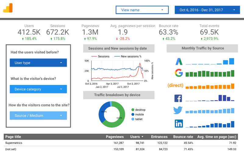
First Interface: After logging in to Google Data Studio you will interact with this layout.
Next Move: The next step in creating your first report is to check out the left sidebar, you can see some options given like choosing your reports and data sources. The next move is picking the reports option.
After choosing it, you need to click on the (+) button given in the right bottom. It will send you on a blank canvas to show your creativity and transform your data into an amazing visual.
Starting Visualization:
Before you began updating the blank canvas, you need to add a data source to visualize your data manually. There are some predefined sample data given in the right sidebar. From here you can choose the sample data provided by Google.
For this guide, we have selected the Sample Google Analytic data and started the visualization.
Make Simple Bar Chart:
You can make a chart of your specific data by clicking on the option “Add a Chart” then selecting the chart type. After that all you need to customize it according to your needs like setting up the dimension and metrics to visualize your data.
Example of making a chart in Google Data Studio.
Time Series Chart:
Time series is the type of chart in which you can show the time data comparison according to the time. In this chart, you can use the bar or lines option to display your data.
You can use the different options of data modification like selecting the date range, Data control, filter, URL embedding, etc. It is handy for creating Analytic reports and filter data concerning the time domain.
Analytic Connectivity:
If you have a Google Analytic account and want to integrate it with Data Studio, you need to follow the simple steps given below.
- Select the data source option provided in the sidebar after choosing the chart type.
- Create a new data source and select analytics.
- Choose the specific property and add the data.
Preview the Data:
After getting done with the changes you want to make in the report, you can preview your data sheet by clicking on the “View” option given on the top right corner.
Benefits of Using Google Data Studio:
There are many benefits to use Data Studio for reporting, here we are listing a few of them below:
1) Free of Cost:
It is one of the best open source data visualizing tools which provides its user all the features without charging a single penny.
2) Report Customization:
While using data studio you will interact with a blank canvas, and you can use it for creating a single page or multi-page reports. You can even customize the size of columns just by dragging and dropping. The formatting option empowers you to customize your report as per your branding and color needs.
3) Merge Data:
One of the best features of Google data studio is to merge the data from 90 different sources. While customizing the reports, you can choose as many data resources as you need. It is the best way to merge data from entirely different sources on one dashboard without facing any error.
4) Widget Lover:
If you love to use widgets then Data Studio will be a place where you would enjoy working. In Data Studio you can add the widget as many charts and tables as you want.
5) No API Restriction:
In Google Analytics you can use as much as seven dimensions at once, but in Data Studio you do not need to be worried about limits. When you connect your Google Analytics account, it will access all the data in a single shot.
Conclusion: As it says, the best time to start something is right now. When you begin with Google Data Studio, you are about to unleash the power of this excellent tool.
If you have a business and want your data to visualize your digital marketing, you can contact any good digital marketing agency to help you with that.