

With today’s competitive mobile app market, it’s more important than ever to stand out and develop a unique brand identity through user experience (UX) design. While most companies recognize the value of mobile app design as the key driver for customer conversion, they often don’t recognize how to use UX design strategically to deliver new values.
Many people see UX as interface and visual design, however, there’s much more to it than that. The UX discipline is deeply rooted in research and testing. UX Designers balance must-haves, nice-to-haves, trends and innovation, independent research, and so on.
The misunderstanding surrounding UX stems from some common misconceptions about what it is and how exactly it fits into the mobile app development process. This post breaks down 9 mobile app UX mistakes to avoid to delight users and maximize business outcomes.
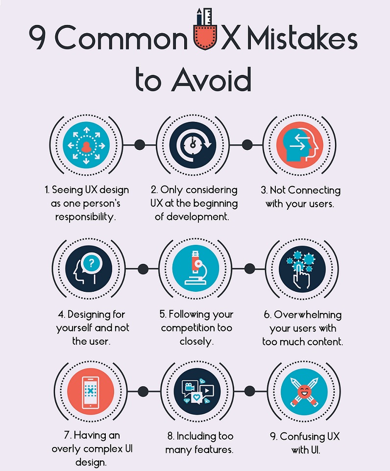
Mistake #1: Seeing UX as One Person’s Responsibility
User experience isn’t just the responsibility of a department or an individual designer. The whole team should be involved in the mobile app design. The team should have a common goal or vision of the user experience that they can deliver collectively.
Mistake #2: Only Considering UX at the Beginning of Development
UX is an ongoing effort. To create a great experience, you should listen to your users, understand what they like and dislike, and keep iterating.
A good way to validate assumptions is by testing your mobile app with your core set of users. A Proof of Concept, Prototype, or MVP will ensure that your product idea is received well by users, increasing the chance of success of your product launch. The most successful apps, such as Uber, Airbnb, Dropbox, and Snapchat, started simple and iterated as they learned more about what their users wanted.
Mistake #3: Not Connecting With Your Users
Good UX leaves a lasting impression. Many companies struggle when it comes to providing meaning and forming a connection with users. Meaningful products have personal significance and resonate with users’ needs while aligning with their values. Many products in the market are aesthetically pleasing and are usable but still lack meaning. How are you connecting with your user? Helping them achieve a goal? Helping them feel part of a community? Ask yourself what impression you’re leaving with your users. This will be the difference between an app your users return to and one they delete.
Mistake #4: Designing For Yourself and Not the User
Development teams can often form strong opinions about a product. Good UX designers separate their personal preferences from user preferences. It’s important to understand that you are designing for a core set of users with specific needs and wants. This user-centric design approach should be practiced throughout the entire development process so that the app doesn’t evolve to fit the needs of the people creating it.
Mistake #5: Following Your Competition Too Closely
What works for one company might not work for the other. Instead of imitating your competition, learn from them and combine that with your innovation, which will help you establish a competitive edge. When you follow suit to your competition, you aren’t providing anything new for your users. With thousands of apps in the market, you need to offer new, innovative, and valuable features for your users.
There is no mobile app cheat sheet, (but there is this checklist). Certainly, there are sources of inspiration to draw from, but trends that work for other companies may end up dating your app later. Instead, analyze why trends are working, then apply this insight to suit your business and user’s needs; you can improve, customize, and build from this foundation. As with all products, research will make for a stronger experience at the end, when you tailor it to your audience and platform.
Mistake #6: Overwhelming Your Users With Too Much Content
Use content to guide the user through your app, providing value along the way. You don’t need to cram everything onto the first screen. It overloads users with information, in turn, frustrating them. Users like the interactivity of mobile app design because they enjoy the satisfaction of self-initiated discovery.
Mistake #7: Having an Overly Complex UI Design
Good UX doesn’t always have a fancy, intricate design. Complex UI design can take away from the user experience if there are too many distractions or confusing call-to-actions. Instead of including elements that lack purpose, simplify with more meaning. Good design can be elegant without all of the intricacies.
Mistake #8: Including Too Many Features
Rather than including too many elements and features, understand your brand’s strengths. When you visit a restaurant with a menu that has every type of cuisine, it can overwhelm you. While it may seem beneficial to cater to everyone’s needs, it’s disjointed and puts into question the restaurant’s ability to truly specialize in what they’re good at.
This is just as relevant to brand identity. If your app includes everything for all types of demographics, you won’t please anyone. Instead of establishing loyal users, you’ll end up frustrating them. Not only is this bad for user retention but the perception of your brand as well. Find your unique value proposition that will give you the competitive edge you need.
Mistake #9: Confusing the UI with UX
The UX & UI are different. Mobile app design is continually evolving. As the nature of the work changes with technology so does the way people describe it. The confusion most likely stems from the overlap of the skill-sets and tools involved in both disciplines.
It’s nearly impossible to extricate the UI from the UX and vice versa. You can’t work on one design concept without considering the other. Good UX design is so subtle and natural that it seems obvious and effortless for the user. The amount of analysis involved is invisible to the end user. It is the foundation or the structure of the app. UI design, on the other hand, consists of compelling and aesthetically pleasing interfaces with which the user interacts with. It is the exterior. Knowing when and how to utilize both of these design disciplines will be crucial to the success of your app.
Closing Thoughts
These 9 mistakes can derail projects from maximizing their impact on business outcomes. Further, understanding how to overcome common UX mistakes will encourage flexibility and break through perceived limitations. When you eliminate the barriers, these common UX mistakes impose, the result is a better end product that delights your users.