
Brochure design is always preferred to be simplistic. But, designing a minimalist brochure is not as easy as it is perceived. It is a tricky aspect to keep a brochure design simple yet flawless. This is so as everything needs to be flawless for such designing. It has often been found that in the pursuit of preparing a minimalist design, people make it either too dull or exaggerated.
Most importantly, one should not experiment with minimalist best brochure creation. However, if you are too excited about simple brochure design, the following tips can be helpful.
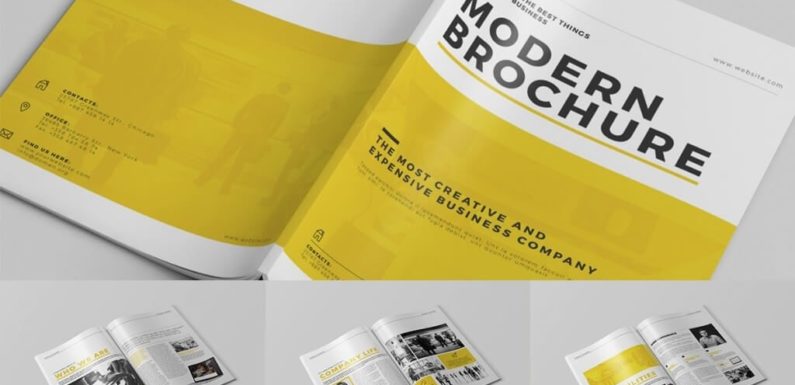
#1 Importance of white space or free space
Space management is crucial in brochure design. It keeps a lot more importance for simplistic designs. To be specific, the artist or designer needs to understand well how to manage the white space. These spaces are challenging as there remain no visual factors. Some people misunderstand white space as the white color; white space means the empty spaces lacking the visual effects.
Killing these spaces with exaggerated elements can extremely affect the process of minimalistic brochure creation. The best recommendation to make the most of these spaces would be to integrate creative taglines or punch lines. It would create a contrasting effect, without affecting the overall design.
It would be even better to implement info-graphics at these spaces. Properly portrayed info-graphic depicting the theme message can perfectly accompany the white space developing the best visual effect. But, it is important to keep in mind that the color effects or designs of the info-graphic should not affect the overall design of the brochure.
#2 Split the entire design into segments
If the purpose is to come up with a minimalist design, priority should be given to scrapping down the extraneous elements. This would discover more space for brochure creation, at the same time keeping it simple. The best approach for executing this strategy would be to split the entire design into certain sub-segments.
This would help in figuring out the points or elements those look exaggerated. Splitting the overall design would help in the proper allocation of spaces for different crafts. Moreover, it offers scope for editing or design correction if required. Editing doesn’t mean removing elements though; it can refer to the addition of certain elements as well.
#3 The perfect combination of color
Perfection in color combination is crucial in any artistic job. Similar is the case about brochure design as well. While going for simplistic brochure design, it is always recommended to use lesser color as it is possible. Specifically, attention must be given while selecting the colors so that it doesn’t make things contrasting to each other.
One can’t call a design simple if the color combination doesn’t accompany. You may use simply a couple of colors, but the effect must be good. One need to ensure that the central color should be comparatively pale, glorifying the upper layer. If you wish to make it more attention dragging, implementing colorful borderline effects would be a nice idea.
#4 Come up with a theme
A simple brochure design can be accomplished from a productivity point of views when it conveys the message well. In this context, one must come up with a proper theme. Themes create scope to be creative with design. The little factors like the selection of palettes help in making the design look minimalistic yet beautiful. All these additions though are quite little in comparison to the whole design, but their effect is indeed way significant.
Maintaining proper volume of text
Brochure creation in modern times can’t be planned without proper texting. It is crucial to keep in mind that the text elements should be thoroughly in line with the graphic elements. When these two aspects accompany well to each other, the design can be minimalistic yet catchy. Best recommendation would be to hire someone specialist for infographic part.
The properly executed infographic strategy can glorify the entire design with minimal text requirements. The volume of text should not be ignored. Excessive letter or text addition can simply make the design look messy. Minimum the amount of text you use for the design, better scope it provides for the prime message to get conveyed.