

Data Cleaning, Transformation and Visualizations with R
Data Cleaning is the method of turning raw data into coherent data that can be analysed. It aims to improve the quality and reliability of statistical claims on the basis of the evidence. Data cleaning can have a profound impact on data-based statistical claims.
In this article, I am going to discuss the process of data cleaning, transforming the data by removing the inconsistencies and inaccuracies and finally applying the charts and graphs to visualize the data using R. I have used a very simple example so that even a beginner would be able to understand it well. You can code in R by learning the online courses available for R Training with Certification.
In this session, I am going to discuss the following topics:
- How to select the inconsistent and inappropriate data columns from dataset?
- How to retrieve inconsistent and inaccurate data rows in the dataset?
- How to transform the data?
- How to apply visualizations to data using a bar chart, pie chart, scatter plot, line chart, histogram, box plot?
Let us begin our topic practically by working on R Studio and executing the code simultaneously. Install R studio on your system, after completion of the setup process, install the package called tidyverse by using the below command in R Studio.
install.packages(“tidyverse”)
Use the below command for attaching the library files of “tidyverse” into R.
library(tidyverse)

Create a CSV file with the following data as shown below. Here we are using the file called “Data.csv”
“Gender”,”Height”,”Weight”,”lbs”
“M”,5,97,”95 – 117 “
“F”,six,132,”144 – 176 “
“F”,5,1120,”90 – 110 “
“M”,6,185,”160 – 196 “
How to create a csv file using excel?
You can also create a csv file using excel. Open the excel sheet, type the data in rows and columns and then save the file type as CSV(comma delimited).
Working Directory
We have to create a working directory for data cleaning and transformation.
Steps for setting the working directory
- In the RStudio, click on the Session menu and then click on Set Working Directory submenu and again click the option Choose Directory.
- Select the location where your data set(CSV) file is located and then click on the Open button.
For the above example, we have placed a “Data.csv” file over the desktop so we choose our working directory as a desktop. The below command will be displayed in RStudio after setting the working directory.
setwd(“C:/Users/admin/Desktop”)
Use the below command to read the file Data.csv.
dataset <- read.csv(file=’Data.csv’)
The data in the CSV file is stored in a dataset variable as data frames by using the ”<-” operator. To view the dataset variable call the below function head() which displays the top lines of data in the terminal.
head(dataset)
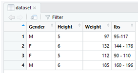
Gender Height Weight lbs
1 M 5 97 95 – 117
2 F six 132 144 – 176
3 F 5 1120 90 – 110
4 M 6 185 160 – 196
From the obtained data, we have found that the data is inconsistent and inaccurate. In the dataset, there is categorical number six instead of numeric 6 which is inconsistent and there is a weight saying 1120 which is also inaccurate. These two things must be cleaned and transformed before analysing the data.
How to select only the inconsistent and inappropriate data columns from the dataset?
Use the select() function to retrieve the inconsistent and inappropriate columns in a data frame and store in a variable called cleaning.
cleaning <- select(dataset,Height,Weight)
Here the “select()” method uses the dataset in the first parameter and the “Height” and “Weight” of the next parameters are the names of the columns specified in the dataset variable that contains “Data.csv”.
You can now view the selected data in the table format, use the method view()to display the data in the form of table rows and columns.
view(cleaning)

How to retrieve only inconsistent and inaccurate data rows in the dataset?
Use the following filter command to retrieve the inconsistent and inaccurate rows in a dataset, here we need to apply the conditions such as Height==’six’| Weight==1120 so as to retrieve only the relevant data from the data set. The below function provides the relevance in filtering the unwanted data and the output is displayed in the terminal.
change <- filter(cleaning,Height==’six’| Weight==1120)
Height Weight
1 six 132
2 5 1120
The “filter()” method is applied to filter only the relevant data which works by applying the conditions. Here the “filter()” follows the parameters “cleaning” which contains only the data values of “Height” and “Weight” columns of a “Data.csv” file which is parsed earlier using ‘select()” method. The next parameter in “filter()” uses the specified condition which retrieves only the relevant rows and columns where Height is ‘six’ or Weight is ‘1120’. The ‘|’ is logical or operator.
How to transform the data?
Now after filtering we are clear that only two variables must be modified in the dataset. The character six must be changed to numerical 6 and the numerical 1120 must be changed to 112. For modifying these two variables we are going to use the if condition statement to point the index location of the data frame to a dataset variable.
if(dataset$Height[2]==’six’) dataset$Height[2]=6
if(dataset$Weight[3]==1120) dataset$Weight[3]=112
The above two statements will now replace the data values of that specific indexes. The variable ‘six’ at index position 2 in Height column is now replaced by assigning it as a number 6. Similarly, the variable ‘1120’ at index position 3 in Weight column is now replaced by assigning it as number 112. To perform this “if()” condition uses “$” operator for pointing the specific elements in the dataset.
Use the view() function to check the data variable if modified in the data frame.
view(dataset)
Now, this data must be written to the destination file which Data.csv. Use the following instruction to write the dataset frame into a Data.csv file.
write.csv(dataset, file=”Data.csv”)
Open the “Data.csv” file and check whether the data is transformed correctly.
“”,”Gender”,”Height”,”Weight”,”lbs”
“1”,”M”,”5″,97,”95-117 “
“2”,”F”,”6″,132,”144 – 176 “
“3”,”F”,”5″,112,”90 – 110 “
“4”,”M”,”6″,185,”160 – 196 “
How to use Data Visualizations?
Visualizations are the graphical representation of dataset variables. There are several graphical representations such as bar chart, column chart, histogram, pie chart, line chart, box plot, scatter plot etc. can be used to present the data in 2D or 3D views.
Bar Chart
We now construct the bar chart for the transformed data of Data.csv file. Apply the following instructions in R to display the bar chart for age and weight data variables of the patients.
dataset <- read.csv(file = “Data.csv”)
ggplot(data = dataset) + geom_bar(mapping = aes(x = Weight, y = Height), stat = “identity”)
The “ggplot” is a data visualization package designed for this statical programming using R. When you assign the variable “dataset” into “data”, you are allowing the “Data.csv” file into the variable “data” which is already read by the dataset using “read.csv()”. The “ggplot()” method is appended with “geom_bar()” by using “+” operator for mapping the dataset to display its data using bar charts. This “geom_bar()” uses the aesthetic function to map the data considering the x and y dimensions. The variable “x” uses the data of Weight column in the “Data.csv” file while variable “y” uses the data of Height column in the “Data.csv” file. The parameter stat=”identity” used in “aes()” method is applied for displaying the heights of the bars to represent values in the data.
The following graph will be displayed at the right side in RStudio window under Plots tab.

Consider the below instructions for displaying the mean weight of all patients for male and female categories. We use “barplot()” to display the bar chart for mean weights of two genders.
M_data <- filter(dataset,Gender==’M’)
F_data <- filter(dataset,Gender==’F’)
M_weight <- mean(M_data$Weight)
F_weight <- mean(F_data$Weight)
Mean_weight <- c(M_weight,F_weight)
barplot(Mean_weight, main=”Weight of patients”, xlab=”Gender”, ylab=”Weights”, col=c(“blue”,”red”) ,legend.text = c(‘M’,’F’))
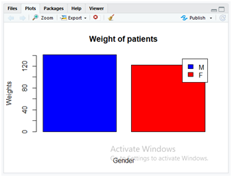
In the above code, we are filtering only the data related to “Male” and “Female” specific to gender. As the dataset uses ‘M’ for male and ‘F’ for female patients, correspondingly the filtered content is stored separately in those variables “M_data” and “F_data”. In the next few steps, the mean weight of the patients is calculated using “mean()” method on “M_data” and “F_data” separately and correspondingly the mean weights are stored separately in variables “M_weight” and “F_weight”. Now both these separate values of mean weights are combined using “c()” method. The “C()” method combines the data values of “M_weight” and “F_weight” after passing these column values as its parameters. These combined mean weight values are now stored in a variable Mean_weight.
In the next step, the “barplot()” method is applied to display the bar chart containing various parameters. The description of parameters is as follows.
- Mean_weight: It contains the combined values “M_weight” and F_weight” of mean weight as performed earlier.
- main: This parameter is used for displaying the title on the graph as “Weight of patients”.
- xlab: It labels the x-axis as Gender.
- ylab: It labels the y-axis as Weights.
- col: It used to colour the graphs and we used a combination of two colours blue and red by implementing with c() method.
- legend.text: It displays the legend texts on the graph as “M” and “F” identifies with blue and red colours for male and female patients as specified using c() method.
Box Plot
We can construct a boxplot for the same data to display the box plots for Gender and Weight data variables. Use the following command to display the box plot.
ggplot(data = dataset, mapping = aes(x = Gender,y = Weight)) +
+ geom_boxplot()
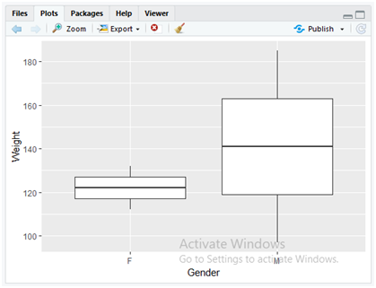
In the above code, as discussed earlier in the bar charts, here also we have appended “ggplot()” and “geom_boxplot()” methods for mapping the statistical data on the graph. The “geom_boxplot()” method directly plots the boxplot for the “ggplot()” data which implements aesthetic mapping parameters of “x” and “y” dimensions of “gender” and “weight” columns from a dataset stored in the parameter variable “data”.
Use the below instruction to flip the box plots from Y direction to X direction.
ggplot(data = dataset, mapping = aes(x = Gender,y = Weight)) + geom_boxplot() + coord_flip()
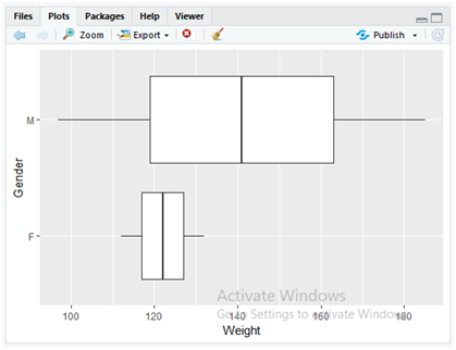
The above code simply appends the method “coord_flip()” method to the previous boxplot code so as to flip the boxplot view. The “coord_flip()” method flips the coordinates of x and y dimensions to the previous boxplot.
Pie Chart
Use the below instruction to display the pie chart for the data variables Weight and the lbs range with percentile.
pct <- round(dataset$Weight/sum(dataset$Weight)*100)
lbls <- paste(dataset$lbs, pct)# add percent’s to labels
lbls <- paste(lbls,”%”,sep=””)# add % to labels
pie(dataset$Weight,labels=lbls,col=rainbow(length(lbls)), main=”Pie Chart for Weights”)
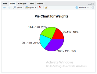
In the above code, first, we are going to perform the percentile for all values in the “weight” column of a dataset with simple mathematical calculation. The calculated percentiles are then stored in a variable “pct”. Here the “paste()” method is used for concatenating the strings. In the dataset “Data.csv” the column “lbs” values are now concatenated with the percentile of “weight” column values of that specific row elements by using paste(dataset$lbs, pct). This is now stored in the variable “lbls”. In the next step, the calculated percentile values are now concatenated with the “%” symbol for each row value without providing any spaces to the parameter sep=””.
Finally, the pie() method is implemented for displaying a pie chart. The parameter description is as follows.
- dataset$weight: This parameter takes the values of the “weight” column from the dataset “Data.csv”.
- labels: The variable “lbls” values are passed to this parameter that contains the concatenated results of the operations which are performed to display it over the pie chart.
- col: It specifies the colour to be used in the pie chart, the “rainbow()” method automatically presents similar colours which exist in a natural rainbow. It uses the parameter “length(lbls)” to calculate the length of rows and divide the colours accordingly in the graph.
- main: The parameter is used to display the title of the graph as “Pie Chart for Weights”.
Line Chart
The below is an instruction for displaying the weights of each patient on a line chart.
plot(dataset$Weight,type = “o”,col = “red”, xlab = “Patient’s serial numbers”, ylab = “Weight of patients”, main = “Chart on Weights”)

To display the line charts a simple “plot()” can be used in R. The parameters of “plot()” method describes the following things.
- dataset$weight: Takes the weight column data from the dataset “Data.csv”.
- type: “o” is the type of line plot used for applying the overplotted points and lines.
- col: Specifies the colour applied which is red.
- xlab: To display the label for x-axis data which is “Patient’s serial numbers”.
- ylab: To display the label for y-axis data which is “Weight of patients”.
- main: To display the main title for the plot as “Chart on Weights”.
Histogram
Present the histogram with the below instructions and display the graph for the weights of patients data.
Weight <- dataset$Weight
hist(Weight,col = “green”)

Simple “hist()” method displays the histogram that passes the data values of “Weight” column of “Data.csv” and the specified colour to be applied as green in the next parameter of “col”.
Scatterplot
Present the scatterplot for Weight’s of patients from the dataset by applying the below instruction.
plot(dataset$Weight,dataset$Height,main=”Scatter plot”, xlab = “Weight”, ylab = “Height”,pch = 20)

You can also display the scatter plot with the same method “plot()” by using the parameters as similar to the line plot. In the above code, the description of the parameters is as follows.
- dataset$weight: Takes the weight column data from the dataset “Data.csv”.
- dataset$height: Takes the height column data from the dataset “Data.csv”.
- main: To display the main title for the plot as “Scatter plot”.
- xlab: To display the label for x-axis data which is “Weight”.
- ylab: To display the label for y-axis data which is “Height”.
- pch: It pitches the colour symbol that will be used in the scatter plot which is a black circular dot for the argument value 20.
You can also use the R scripts to code and execute them over a file by following the below instructions.
How to create R scripts?
Steps for creating R Script
1) Open RStudio, in the File menu, click on New File and then click R script.
2) Type the script code in the text editor which is displayed as untitled.
3) Click the save button in the text editor or use Ctrl+S.
4) Select the location and provide the filename and then click the Save button and close RStudio window.
How to run R script?
Steps for running R Script
1) Open the R script file and then click on the Run button in the text editor or press Ctrl+Enterto execute each instruction until the desired output is obtained.
2) To execute each instruction all at a single attempt, click on the source button in the text editor file and then click on the sub-menu option Source with Echo or press Ctrl + Shift + Enter.
Conclusion:
Thus you can adopt R coding which is very simple to use for performing the analytics on the data. R coding is not that complex like other programming languages. R is mostly preferable to perform the cleaning and transformation operations on the huge datasets as it requires very less coding practices.