

In Xamarin, the visual structure of ContentPage-derived pages and ContentView-derived custom controls can be defined using Forms control templates. The user interface (UI) for a custom control, or page, is separated from the logic that implements the control or page using control templates. At a pre-defined position, more content can be inserted into the templated custom control or templated page.
For example, to create behaviors with Xamarin.Forms and seamlessly redefine the UI, a control template with custom control can be developed efficiently. The needed custom control instance can then consume the control template. A control template, on the other hand, can be used to specify any common UI that will be shared by several pages in an application.
Create a Control Template
The code for a CardView custom control is shown in the following example:
public class CardView : ContentView
{
    public static readonly BindableProperty CardTitleProperty = BindableProperty.Create(nameof(CardTitle), typeof(string), typeof(CardView), string.Empty);
    public static readonly BindableProperty CardDescriptionProperty = BindableProperty.Create(nameof(CardDescription), typeof(string), typeof(CardView), string.Empty);
    // ...

    public string CardTitle
    {
        get => (string)GetValue(CardTitleProperty);
        set => SetValue(CardTitleProperty, value);
    }

    public string CardDescription
    {
        get => (string)GetValue(CardDescriptionProperty);
        set => SetValue(CardDescriptionProperty, value);
    }
    // ...
}
A custom control that shows data in a card-like arrangement is represented by the CardView class, which inherits from the ContentView class. The data it presents is represented by properties that are backed by bindable properties. The CardView class, on the other hand, does not define any user interface. Instead, a control template will be used to define the user interface. See Xamarin.Forms ContentView for more information on creating Content View-derived custom controls.
The ControlTemplate type is used to generate a control template. You use View objects to design the UI for a custom control or page when you create a ControlTemplate. Only one View can be the root element of a ControlTemplate. Other View objects are normally found in the root element. The visual structure of the control is made up of a collection of objects.

The ControlTemplate type is used to generate a control template. You use View objects to design the UI for a custom control or page when you create a ControlTemplate. Only one View can be the root element of a ControlTemplate. Other View objects are normally found in the root element. The visual structure of the control is made up of a collection of objects. If you declare a control template in the root element of your application definition XAML file, for example, you can use it everywhere in your app. Only that page can use the control template if you define it in a page. See Xamarin.Forms Resource Dictionaries for additional information about resources.
A ControlTemplate for CardView objects is shown in the XAML sample below:
<ContentPage xmlns="http://xamarin.com/schemas/2014/forms"
             xmlns:x="http://schemas.microsoft.com/winfx/2009/xaml"
             ...>
    <ContentPage.Resources>
      <ControlTemplate x:Key="CardViewControlTemplate">
          <Frame BindingContext="{Binding Source={RelativeSource TemplatedParent}}"
                 BackgroundColor="{Binding CardColor}"
                 BorderColor="{Binding BorderColor}"
                 CornerRadius="5"
                 HasShadow="True"
                 Padding="8"
                 HorizontalOptions="Center"
                 VerticalOptions="Center">
              <Grid>
                  <Grid.RowDefinitions>
                      <RowDefinition Height="75" />
                      <RowDefinition Height="4" />
                      <RowDefinition Height="Auto" />
                  </Grid.RowDefinitions>
                  <Grid.ColumnDefinitions>
                      <ColumnDefinition Width="75" />
                      <ColumnDefinition Width="200" />
                  </Grid.ColumnDefinitions>
                  <Frame IsClippedToBounds="True"
                         BorderColor="{Binding BorderColor}"
                         BackgroundColor="{Binding IconBackgroundColor}"
                         CornerRadius="38"
                         HeightRequest="60"
                         WidthRequest="60"
                         HorizontalOptions="Center"
                         VerticalOptions="Center">
                      <Image Source="{Binding IconImageSource}"
                             Margin="-20"
                             WidthRequest="100"
                             HeightRequest="100"
                             Aspect="AspectFill" />
                  </Frame>
                  <Label Grid.Column="1"
                         Text="{Binding CardTitle}"
                         FontAttributes="Bold"
                         FontSize="Large"
                         VerticalTextAlignment="Center"
                         HorizontalTextAlignment="Start" />
                  <BoxView Grid.Row="1"
                           Grid.ColumnSpan="2"
                           BackgroundColor="{Binding BorderColor}"
                           HeightRequest="2"
                           HorizontalOptions="Fill" />
                  <Label Grid.Row="2"
                         Grid.ColumnSpan="2"
                         Text="{Binding CardDescription}"
                         VerticalTextAlignment="Start"
                         VerticalOptions="Fill"
                         HorizontalOptions="Fill" />
              </Grid>
          </Frame>
      </ControlTemplate>
    </ContentPage.Resources>
    ...
</ContentPage>
A key must be supplied using the x:Key attribute when a ControlTemplate is declared as a resource so that it can be identified in the resource dictionary. In this case, the CardViewControlTemplate’s root element is a Frame object. The Frame object uses the RelativeSource markup extension to set its BindingContext to the templated parent, which is the runtime object instance to which the template will be applied. The visual framework of a CardView object is defined by the Frame object, which combines Grid, Frame, Image, Label, and BoxView elements. Because these objects inherit the BindingContext from the root Frame element, their binding expressions resolve to CardView attributes. See Xamarin for more details on the RelativeSource markup extension. Relative Bindings are formed.
Consume a Control Template
By setting the ControlTemplate attribute to the control template object, a ControlTemplate can be applied to a Content View-derived custom control. Similarly, by setting the ControlTemplate property of a Content Page-derived page to the control template object, a ControlTemplate can be applied to the page. When a ControlTemplate is applied to a templated custom control or templated page at runtime, all of the controls defined in the ControlTemplate are added to the visual tree of the templated custom control or templated page.
Each CardView object’s ControlTemplate attribute is allocated the CardViewControlTemplate in the following example:
<ContentPage xmlns="http://xamarin.com/schemas/2014/forms"
xmlns:x="http://schemas.microsoft.com/winfx/2009/xaml"
xmlns:controls="clr-namespace:ControlTemplateDemos.Controls"
...>
<StackLayout Margin="30">
<controls:CardView BorderColor="DarkGray"
CardTitle="John Doe"
CardDescription="Lorem ipsum dolor sit amet, consectetur adipiscing elit. Nulla elit dolor, convallis non interdum."
IconBackgroundColor="SlateGray"
IconImageSource="user.png"
ControlTemplate="{StaticResource CardViewControlTemplate}" />
<controls:CardView BorderColor="DarkGray"
CardTitle="Jane Doe"
CardDescription="Phasellus eu convallis mi. In tempus augue eu dignissim fermentum. Morbi ut lacus vitae eros lacinia."
IconBackgroundColor="SlateGray"
IconImageSource="user.png"
ControlTemplate="{StaticResource CardViewControlTemplate}" />
<controls:CardView BorderColor="DarkGray"
CardTitle="Xamarin Monkey"
CardDescription="Aliquam sagittis, odio lacinia fermentum dictum, mi erat scelerisque erat, quis aliquet arcu."
IconBackgroundColor="SlateGray"
IconImageSource="user.png"
ControlTemplate="{StaticResource CardViewControlTemplate}" />
</StackLayout>
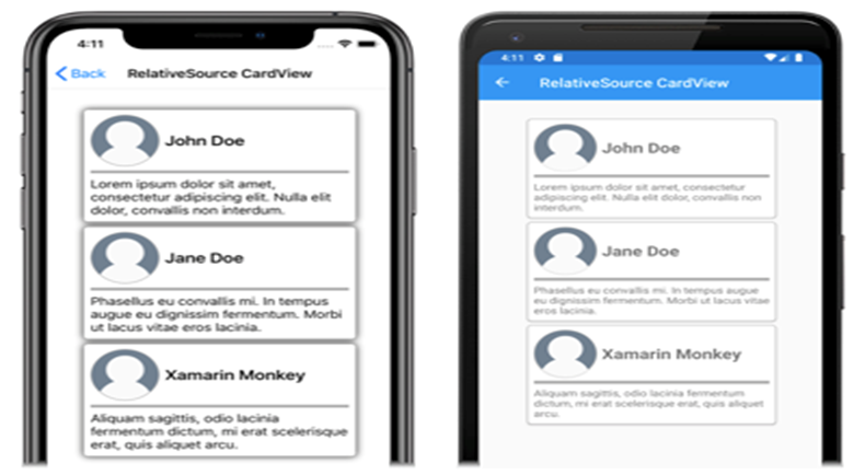
</ContentPage>The controls in the CardViewControlTemplate are included in the visual tree for each CardView object in this example. The Frame and its children resolve their binding expressions against the properties of each CardView object since the root Frame object for the control template assigns its BindingContext to the templated parent.
The CardViewControlTemplate is applied to the three CardView objects in the following
Pass Parameter with TemplateBinding
The TemplateBinding markup extension links a public property defined by the templated custom control or templated page to a property of an element in a ControlTemplate. When you utilize a TemplateBinding, you allow the control’s properties to be used as template parameters. When a property on a templated custom control or templated page is set, the value is sent to the element with the TemplateBinding.
The following XAML example uses the TemplateBinding markup extension to create a ControlTemplate for CardView objects:
<ContentPage xmlns="http://xamarin.com/schemas/2014/forms"
             xmlns:x="http://schemas.microsoft.com/winfx/2009/xaml"
             ...>
    <ContentPage.Resources>
        <ControlTemplate x:Key="CardViewControlTemplate">
            <Frame BackgroundColor="{TemplateBinding CardColor}"
                   BorderColor="{TemplateBinding BorderColor}"
                   CornerRadius="5"
                   HasShadow="True"
                   Padding="8"
                   HorizontalOptions="Center"
                   VerticalOptions="Center">
                <Grid>
                    <Grid.RowDefinitions>
                        <RowDefinition Height="75" />
                        <RowDefinition Height="4" />
                        <RowDefinition Height="Auto" />
                    </Grid.RowDefinitions>
                    <Grid.ColumnDefinitions>
                        <ColumnDefinition Width="75" />
                        <ColumnDefinition Width="200" />
                    </Grid.ColumnDefinitions>
                    <Frame IsClippedToBounds="True"
                           BorderColor="{TemplateBinding BorderColor}"
                           BackgroundColor="{TemplateBinding IconBackgroundColor}"
                           CornerRadius="38"
                           HeightRequest="60"
                           WidthRequest="60"
                           HorizontalOptions="Center"
                           VerticalOptions="Center">
                        <Image Source="{TemplateBinding IconImageSource}"
                               Margin="-20"
                               WidthRequest="100"
                               HeightRequest="100"
                               Aspect="AspectFill" />
                    </Frame>
                    <Label Grid.Column="1"
                           Text="{TemplateBinding CardTitle}"
                           FontAttributes="Bold"
                           FontSize="Large"
                           VerticalTextAlignment="Center"
                           HorizontalTextAlignment="Start" />
                    <BoxView Grid.Row="1"
                             Grid.ColumnSpan="2"
                             BackgroundColor="{TemplateBinding BorderColor}"
                             HeightRequest="2"
                             HorizontalOptions="Fill" />
                    <Label Grid.Row="2"
                           Grid.ColumnSpan="2"
                           Text="{TemplateBinding CardDescription}"
                           VerticalTextAlignment="Start"
                           VerticalOptions="Fill"
                           HorizontalOptions="Fill" />
                </Grid>
            </Frame>
        </ControlTemplate>
    </ContentPage.Resources>
    ...
</ContentPage>
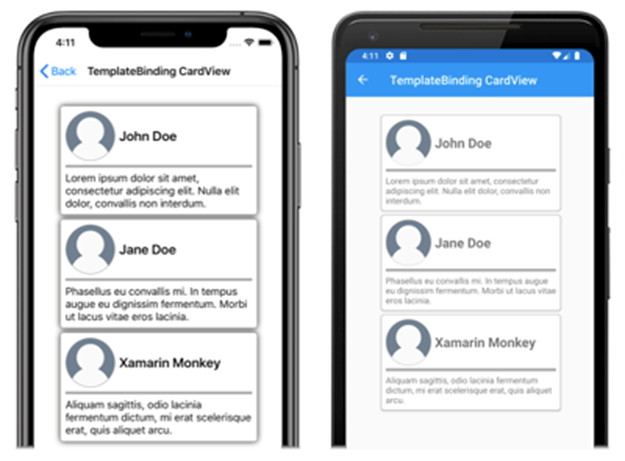
The TemplateBinding markup extension resolves binding expressions against each CardView object’s properties in this example. The CardViewControlTemplate is applied to the three CardView objects in the following screenshots:
Conclusion
In this blog, we have deeply discussed the concepts of Creating a Control template, consuming a Control template, and Passing Parameters with TemplateBinding. This will help you comprehend the usage of controls in various scenarios.
Technocrat and entrepreneur of a reputed esteemed PowerPoint Add-in Development Company with years of experience in building large-scale enterprise web, cloud, and mobile applications using the latest technologies like ASP.NET, CORE, .NET MVC, Angular, and Blockchain. Keen interest in addressing business problems using the latest technologies and helping organizations achieve goals.