
![4 Elements of High Converting Landing Pages [Examples Included]](https://www.techwebspace.com/wp-content/uploads/2018/01/landing-page-template-dribble-600x385.jpg)
Ah, the buyer’s journey – the key to building trust with prospects while developing a long-lasting relationship. But how exactly does one move a buyer along this journey? Well, you present highly targeted and relevant content offers at the right time and in the right place. You understand your audience and provide solutions (offers) to their problems, then utilize landing pages to distribute them. Landing pages exist to progress a buyer throughout the different stages of the journey. With so many different landing page designs out there, it’s important to see what works and what doesn’t.
Through much research, we’ve found these 4 common elements among high converting landing pages:
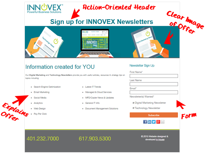
1.) Clear Display
A recent HubSpot article stated that the average visitor only spends 15 seconds on a landing page. Because of this, you need to make sure your messaging and content are concise and easily understood. This includes your action items, offer, form, and body copy. When a landing page loads, the prospect should immediately know what the point of the landing page (offer) is, and how they can get it. Whitespace is crucial here as poor readability will deter prospects from progressing further down your funnel.
Don’t pollute your page with too many bullets describing the offer either. Write in a way that is very concise and enticing so that the offer becomes even more desirable. For example, if you’re offering a downloadable eBook, you don’t need to state each section of the eBook; rather, share key points that will make your prospect hungry for me. Ask yourself – what value will your prospect gain from this asset? Also, be sure to leave out site navigation and links to other pages. When a prospect is on a landing page, we want to make sure their focus is only on the offer.
Below is an example of a simple landing page following best practices:
2.) Visually Engaging
On a marketer’s list of priorities, engagement is consistently in the top 3. So you need to be able to create a page that is engaging on its own. You’re going to create it, but it needs to be able to sell itself.
Here is where you need to take a step backward and map out your priorities. The list of landing page priorities should look similar to this:
1) Offer
This should be a high-quality image that immediately attracts focus.
2) Action to receive it
Tell the person what steps need to be taken for them to get the offer.
3) Form
Keep this above the page fold! Keeping a buyer from having to scroll greatly increases conversion rates.
4) Copy
Concise information about the offer. This needs to be written in a way that a buyer knows what they are getting and doesn’t need to read multiple paragraphs to understand. Bullet points are great here.
3.) Action Oriented
In order for it to be a high converting landing page, you have to make it known how the buyer will get the chosen offer. Is it a downloadable eBook? Do you want them to subscribe to a newsletter? Whatever the offer is, the buyer needs to immediately know what steps they have to take in order to receive it. Try using wording that makes them feel like they are getting something for themselves – rather than you promoting something. For example, “Get my eBook now” is the better wording for a form-submit button than “Get your eBook now” is. Be sure not to ask for too much from buyers early in the journey or they may be discouraged from continuing on.
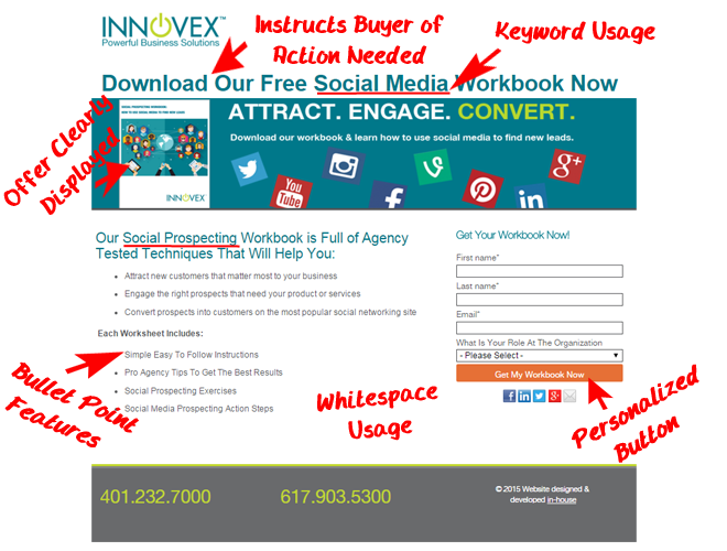
4.) SEO Effectiveness
While keyword importance has seemingly been downplayed in recent years, it is still a very important element to a high converting landing page. Begin by performing keyword research relevant to what you feel your buyers would be searching for in each given stage of the buyer’s journey. Utilize the keywords on your landing page primarily in the headers, text, meta-description, and page URL. It is also good practice to utilize these in the body copy of the landing page if it allows for your page to still flow smoothly. User experience is key here, as Google will be paying close attention to on-page signals like dwell time and bounce rate. Keyword-stacking makes for choppy reading; remember, landing pages are for consumers – not search engines.
Now that you know the four key elements to effective landing pages, take a look at some of our personal favorite examples.
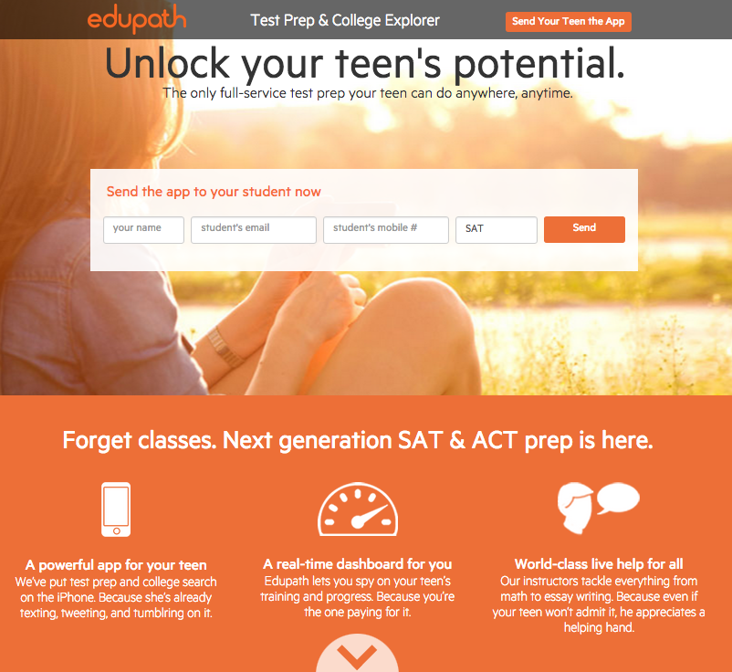
I enjoy this example from edupath for 3 reasons:
- The message is very targeted.
- The form is the focus of attention.
- The use of the background image increases the engagement of this page.
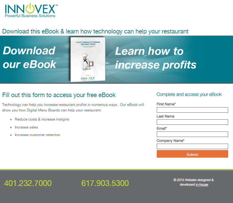
This example is from our client INNOVEX. Key points here:
1. The message touches on the pain point of increasing profits for restaurant owners.
2. It includes a very simple description of what to expect in the eBook.
3. There is no scrolling required and the form is very basic and easy to submit.

This page from Lyft is a great example of why simple is sometimes better.
1. The message is as straightforward as possible.
2. The form stands out more than any other element.
3. The form-submit button attracts attention and makes buyers more likely to submit.
As an inbound marketing agency, we live and breathe HubSpot. They recently shared a blog post on great landing page examples that we recommend checking out. Let us know in the comments if we missed any elements you think are most important to high converting landing pages!