

According to a survey conducted in February 2019, 96% of Americans now own a cellphone of some kind, among which 81% own smartphones, up from just 35% in 2011. The number is only expected to grow! And these millions of smartphone users are not using mobile phones to make calls, text messages or send emails. They are using smartphones for almost everything possible via internet, such as social networking, surfing net for news and information, buying products.
So if you are a business owner and have a website especially eCommerce site that is optimized for mobile traffic, you could be losing potential customers and sales. Today, with a growing number of smartphone users, it has become a pre-requisite for companies to go responsive with their websites in a hassle-free manner.
Here are 10 key points to consider while making your website mobile-friendly.
Know your Needs for a Mobile Website

Usually the need for creating a mobile-friendly website when:
- You need a brand new website for both desktop and mobile
- You are planning to redesign an existing website, which will include a new mobile site
- Your website is not compatible with small screen
Each of these needs brings a different set of requirements, knowing your requirement can help you take the best foot forward as you consider the points given below.
Consider your business objectives

Regardless of your need to go responsive, you will need to prioritize your business objectives, which is then communicated in your design. When transforming your design to mobile, you’ll need to focus on a couple of top priority objectives for the business and communicate them to your web designer/developer.
Study Google Analytics
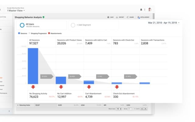
If you are planning to transform your existing desktop version of the website into a mobile website, study data tracked by Google Analytics (of an existing website) before diving into design and development. It will give you an insight about which devices and browsers your users are using to access your website, and accordingly, you can target these browsers as high priorities when you go from design to development to testing to final launch of the website.
Consider Responsive Webs Design
With so many mobile companies churning so many mobile phones every year, gone are the days when users used to check your site in a few web browsers. Today, having a website is not enough, your website should be optimized enough to fit a vast landscape of, which includes desktop and mobile browsers. Responsive designing is the term that defines the optimization of your website at every screen. Utilizing the latest design and advanced technologies like CSS3, web fonts and HTML 5, you can design a site to scale and adapt to any device it’s viewed on. This is known as responsive designing.
Simplify your Website

When converting a desktop site design to mobile format, you need to simplify things wherever possible. Keeping things simple and to a minimum will reduce downloading time, which always works with mobile websites. Mobile website on the mobile web often involves a simplified approach to design, layout and navigation. With compact screen space at your disposal, you need to choose elements wisely.
Single-Column Layout
As you think of a layout for your web design, a single-column structure makes an ideal choice. Such layout is feasible with a small screen and offers flexibility between different device resolutions and flipping between portrait and landscape mode. When using responsive web design, you can convert a multi-column desktop site layout into a single column layout.
Vertical Hierarchy
If your site has huge information that needs to be presented on the mobile site, one of the best ways to organize the content in a simple and digital way is to set up a collapsible navigation. When opting for a single column layout, you can stack pieces of large content in folding modules, which when tapped upon by the user, leads to the content that they’re interested in and hide the rest.
Go Touch Friendly

Most of the smartphones available in the market are touch screen, hence on the mobile browser, interaction is done by finger touch rather than mouse clicks. This transforms the way in which sites are used on a mobile device. When making your website mobile-friendly, you need to consider the clickable elements of your website and make them ‘tappable’.
Interactive Feedback

When you make your website mobile-friendly, you’ll need to make sure you keep engaging your user by providing obvious feedback for any actions that occur on the front-end of your mobile site. For touch screen devices, when a person taps on a link on your website, it good to support the tap with visual changes to indicate that some action has been initiated. Mobile devices do a great job showing spinning loading gif as it loads the next page.
Time to Test Your Mobile Website

As with any project you undertake, you need to first test it before making applying it on a large scale. Test your website on as many mobiles as possible. Doing this will help you identify the flaws in advance if any.