

What is a Material UI?
Material UI is a free and open-source React component library based on Google’s Material Design. It comes with a large number of prebuilt components that are ready for use in production straight away. This is one of the primary reasons why companies want to hire React developers for application development. Let’s take a closer look at the advantages of Material UI.
What are the advantages of Material UI?
Access to Systematic Documentation:
Like all other products of Google, Material UI also comes with the Google “advantage” and in this case, there exists detailed documentation to help designers understand, explore and start using the set of guidelines without any trouble. This support makes it easier for any designer who wants to learn the material UI and anyone can easily start using material UI.
The Element of Flexibility:
Material Designs also provide some flexibility, despite the fact that there are predefined guidelines for each design scenario. Designers are free to manipulate the various design elements and choose how to implement them. Therefore, it provides the perfect balance of rules and flexibility, allowing designers to be creative.
Classic Design System for Mobile Apps:
Material Designs is one of the most compatible mobile app design systems because it was originally developed for designing Android applications. With more mobile apps as smartphone users grow, this design system is gaining popularity among UI designers around the world. Material Designs has also announced a dark theme that gives designers more flexibility in experimenting with the theme.
Cross-team collaboration:
The material UI’s intuitive developer experience lowers the barriers to entry for back-end developers and non-technical designers, allowing teams to collaborate more effectively.
Trusted by thousands of organizations:
Material UI has the largest UI community for React. It’s about as old as React. Material UI has big community support rather than other UI systems.
Every technology has some advantages and disadvantages. We have seen how material UI is providing lots of advantages to us. Now we will see some disadvantages of material UI.
Harder to Implement for Beginner:
For the beginner, it is difficult to use the material UI. Material UI’s specification is more complicated and harder to implement than other styles like flat design.
Easily Identifiable:
Material Design is immediately identifiable and is strongly associated with Google and, specifically, Android. While this isn’t necessarily a bad thing for everyone, it’s potentially a negative for some.
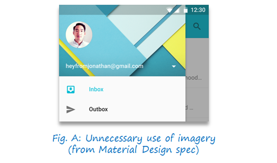
Overuse of images and colours can be distracting:
Material Design still promotes use of vibrant colours and images in its spec. While this can make an interface lively, this style is prone to overuse and can be very distracting to users trying to get something done.
For example, the following menu appears several times in the Material Design documents. It uses an unnecessarily high-contrast header background with multiple layers and off-grid lines which may be fun to look at once, but is functionally crappy because it makes the text hard to read and can get annoying when the menu is opened multiple times:
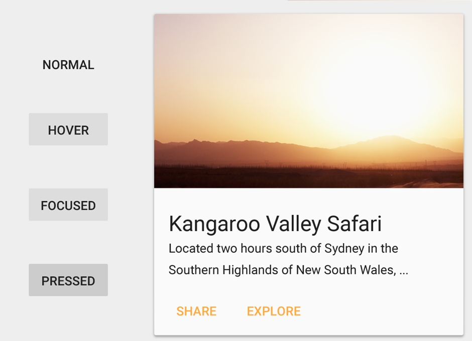
Rectangular Buttons and Cards:
Material design uses a lot of rectangles with sharp corners in its elements. This makes elements less visually appealing to users.
What are the prerequisites for using material UI?
For material UI, make sure that you have npm installed on your computer. Here, We use npm to download and install the dependencies. You also need a code editor.
How to install material UI? To install and save in material UI, you have to use the following command, which will install all the dependencies of material UI.
npm install @mui/material @emotion/react @emotion/styledNow we see the practical with Material UI
- 1. Create React project
npx create-react-app material-ui-with-react- 2. Import the component that you want to use in the React
You can import any component just by passing its name. Here, we are importing the button.
import { Button } from '@mui/material';App.js
import React from 'react'
import { Button } from '@mui/material';
function App() {
return (
Hello, This is material UI with ReactJS.
);
}
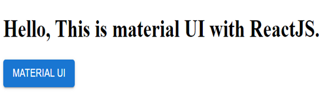
export default App;Material UI comes with lots of CSS you have to just pass the props for it. Like if we want backgroundColor of the button something different then we have one Prop named variant. You can see in the below code in the button we have passed contained a variant that will add blue color in the background. For outlined Button you can use variant= “outlined”, this will create an outlined button.
You can see the below-given output of the above code. Here are different variant images of buttons.
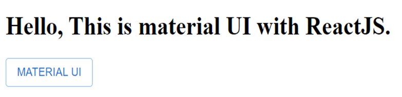
Now, we see the output of the variant outlined. We just have to make changes in props. Like below:
Some examples of Components in Material UI:
- Typography -> To present your design and content as clearly and efficiently as possible.
- Tooltip -> Display informative text when users hover over, focus on, or tap an element.
- Layout -> Use uniform elements and spacing to encourage consistency across platforms, environments, and screen sizes.
- Box -> Serves as a wrapper component for most of the CSS utility needs.
- Container -> Centres your content horizontally. It’s the most basic layout element.
- Grid -> Adapts to screen size and orientation, ensuring consistency across layouts.
- Text Field -> Let users enter and edit text.
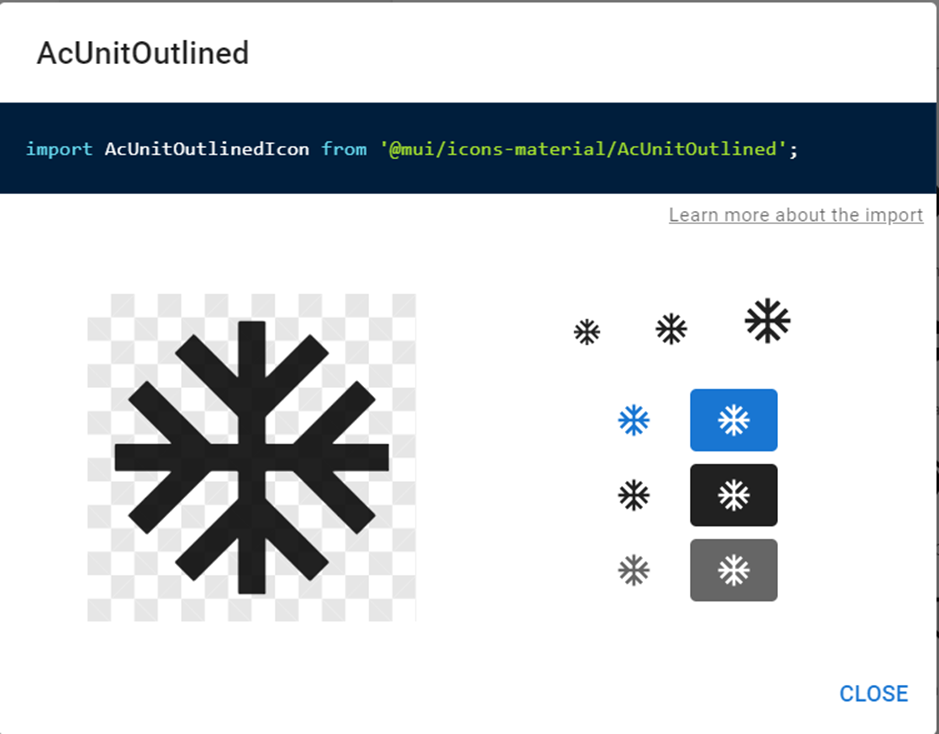
Icons in material UI:
To install material Ui icons, the following commands are required:-
npm install @mui/icons-material @mui/material @emotion/styled @emotion/react
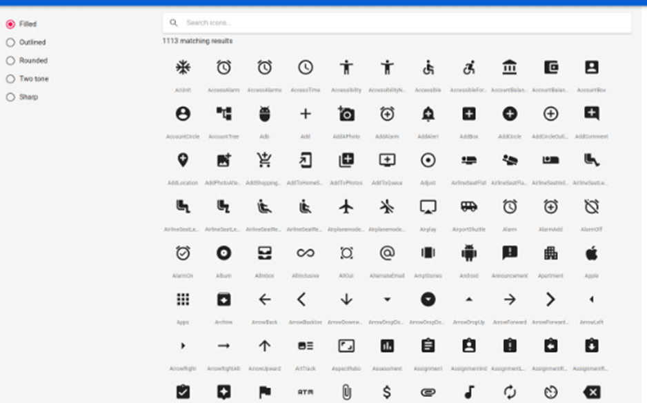
For detailed Icons of Material Ui below is the following link:-
To use these icons in the project, just select any of these icons and copy the code and then
paste it on the top level of your component and then use it.
import Box from '@mui/material/Box';
import Icon from '@mui/material/Icon';
import { visuallyHidden } from '@mui/utils';
// ...
add_circle
Create a user
Styling Of Components
There are three APIs available for generating and applying styles, but they all share the same underlying logic.
Hook API
import * as React from 'react';
import { makeStyles } from '@mui/styles';
import Button from '@mui/material/Button';
const useStyles = makeStyles({
root: {
background: 'linear-gradient(45deg, #FE6B8B 30%, #FF8E53 90%)',
border: 0,
borderRadius: 3,
boxShadow: '0 3px 5px 2px rgba(255, 105, 135, .3)',
color: 'white',
height: 48,
padding: '0 30px',
},
});
export default function Hook() {
const classes = useStyles();
return ;
}
Styled components API
Note: this only applies to the calling syntax – style definitions still use a JSS object. You can also change the behaviour with some limitations.
import * as React from 'react';
import { styled } from '@mui/styles';
import Button from '@mui/material/Button';

const MyButton = styled(Button)({
  background: 'linear-gradient(45deg, #FE6B8B 30%, #FF8E53 90%)',
  border: 0,
  borderRadius: 3,
  boxShadow: '0 3px 5px 2px rgba(255, 105, 135, .3)',
  color: 'white',
  height: 48,
  padding: '0 30px',
});

export default function StyledComponents() {
  return Styled Components;
}


Styled with styled-components API
Higher-order component API
import * as React from 'react';
import PropTypes from 'prop-types';
import { withStyles } from '@mui/styles';
import Button from '@mui/material/Button';
const styles = {
root: {
background: 'linear-gradient(45deg, #FE6B8B 30%, #FF8E53 90%)',
border: 0,
borderRadius: 3,
boxShadow: '0 3px 5px 2px rgba(255, 105, 135, .3)',
color: 'white',
height: 48,
padding: '0 30px',
},
};
function HigherOrderComponent(props) {
const { classes } = props;
return ;
}
HigherOrderComponent.propTypes = {
classes: PropTypes.object.isRequired,
};
export default withStyles(styles)(HigherOrderComponent);Conclusion
For each front-end developer, the material UI is just as important as bootstrap and fluent UI. It is the gateway for any business to acquire a customer and leads. Therefore, keeping a prior focus on user requirements is essential. Here, in this blog, we have learned what is material UI, we have seen various advantages and disadvantages of using material UI, and last, we have seen one practical integration of material UI with ReactJS.
Vinod Satapara – Technical Director, iFour Technolab Pvt. Ltd.
Technocrat and entrepreneur with years of experience building large-scale enterprise web, cloud, and mobile applications using the latest technologies like ASP.NET, CORE, .NET MVC, Angular, and Blockchain. Keen interested in addressing business problems using the latest technologies and have been associated with a reputed .NET development company.